Monday, October 19, 2015

Halloween Decor & Living Room updates


Happy Monday!

Did you notice the blog got a new look?  I thought since our home is getting freshly painted white walls, the blog should get a little makeover too. What do you think?

 How are we half way through October already?
 With Halloween right around the corner I thought I'd give you a peek into our home. If you've been reading my blog for a while you may recall why I love to take my kids trick or treating? ( Hint: it's not for the chocolate…okay, maybe a little) If you don't remember or you want to read about my nosiness you can here.

Normally, I don't decorate so much for Halloween, but this year we are hosting a family Halloween party with 11 (13 including ours) nephews and nieces, so I stepped up our Halloween decor a bit.   If you missed our last cousin Halloween party you can check it out here

I change our chalkboard art seasonally and for birthdays. I'm often asked what I use to write on our chalkboard and although these chalk pens  have to usually be erased with a Magic Eraser, they are still my favorite.


I made this chalkboard a few years ago using this tutorial. The globe string lights are actually just Christmas lights with ping pong balls around them. I made them last Christmas and loved them, so we never took them down.


The mantle pretty much remained the same except I added the small pumpkins and Halloween banner. The banner was purchased from Michaels.  The copper tea light holders are from Target. I couldn't find them online, but I like this one too!


As you can see from the photo above we're starting to put the living room back together and have even added a couple of new pieces. Since the walls have been painted I haven't hung anything back up besides Halloween decorations. You can see what our living room looked like before in this post.

Remember in my last post I showed you inspiration pictures of the look I'm going for in our living room?  Well, I did some serious investigation via a couple clicks on Pinterest and found out that the entryway I pinned belonged to designer  Sarah Sherman Samuel. I had been seriously drooling over her entryway! 
 I was way too excited shocked when I found out the console table was from CB2, still available and affordable! Whaaat!?! #iwillfindyou  Naturally, I tracked it down at the nearest CB2 (which is in Berkeley for all you locals) and made my husband take me to Berkeley for our date night. Which my husband was totally cool with because he's used to me  because there is a tasting room called The Rare Barrel in Berkeley that he had wanted to check out. Win-Win! And that's how we spent our date night because we're super romantic like that. 

I was a little disappointed when I saw the Mills Console table in the store. The table looked black in pictures, but was a more gunmetal grey in person. I almost shied away from purchasing it, but couldn't find anything else that I liked with the same dimensions and price range. Have I mentioned that I'm very indecisive when it comes to buying things!?! Want to go shopping with me? Didn't think so.

As you can see in the picture below I finally made a decision and bought it and you guys…I'm so happy with it! It's narrow, sleek and just down right perfect for our entryway.  Thank you Sarah Sherman Samuel for designing the perfect entryway! Your entryway is like 100 heart eyed Emojis! 


The rattan stool and basket were thrifted. The copper candelabra is from Target and the spider web and spider are from Michaels. You can see what our entryway used to look like here.


I'm still learning how to "style" a room for a photo. In Emily Henderson's new book Styled she talks about how you should photograph a space as if someone was just in the room. It gives the feeling of real life.  I took Emily's advice and tried my best in this shot?! Actually that is exactly where I sit every morning and have my quiet time and devotions before I start my day. 

I posted a picture last week on  Instagram  of the leaf wall hanging I made.  This was a super easy and inexpensive project. I spray painted magnolia leaves with copper spray paint and once they dried I painted a portion of the leaf white. Using a hot glue gun, glue the leaves and feathers to twine. I tied a long piece of leather lace to each end of the stick to use as the hanger.
The black and white striped pillow cover is from Ikea and I made the spider web pillow.  I already had the black pillow cover and drew the spider web on it with a white fabric marker from Michaels.

 The pharmacy floor lamp (similar) and black footstool were thrifted. The marble and copper side table and lamp are from Target. Have I mentioned that I LOVE Target!


I've been a total slacker in putting the gallery wall back up. So, the stairwell has now become the bat wall for the month of October.


Copper and marble Lamp from Target.


Have a great week!

xoxo,


Wednesday, September 16, 2015

changes {Living Room}


Sometimes you just need to change things up, right? 
 This year we have made a few changes to our home. Nothing major, but these changes have made a difference.


  If you follow me on Instagram you may have noticed some of the changes. We  Jake painted over our striped wall (seen here) a dark moody color, which you may have also seen in our powder bath


Let me tell you something about myself. When I'm done with something, I'm done.  I was pretty done and over my striped wall and really really d-o-n-e with our beige walls! We had the house painted beige before we moved in 8 years ago and I was ready for change. There is nothing wrong with beige walls, but I have been wanting a clean blank space for a really really long time. It's like a blank canvas for an artist! 

Painting had been put off for so long because um, hello high ceilings and stairwell. I do love having tall ceilings in our living room and love the open airy feeling, but they do not make it easy for painting or changing out light fixtures!

I picked up some samples and painted a few spots on different walls to see how they looked in different lighting. I then stared at them for weeks  I know it's just paint people, but we may not paint this room for another 8 years. Committing to a color was hard! From the beginning Jake liked Swiss Coffee (white). He used to be a painter before trading in his paint brush for a badge and Swiss Coffee has always been a favorite of his. He wasn't home when I put the samples on the wall and without telling him which samples were which, he picked Swiss Coffee. I almost shied away from white walls altogether and chose an off-white or pale grey because I was scared it would look too stark and too bright. In the end Jake and I both really liked Swiss Coffee the best and went with our gut! 


A couple of weeks ago Jake used his 3 days off from work along with his man muscles and serious painting skills and made this momma happy! #laboroflove  Yes, labor is my love language! I'm pretty sure that labor of love falls under the love language Acts of Service. #justsayin 


He also painted the stairwell but I didn't get any pictures because I literally couldn't even watch! Let's just say it wasn't safe and I'm glad he's not scared of heights!

We still have more painting to do, but I'm so happy with the look of our fresh and clean walls. We used Kelly Moore paint in Swiss Coffee. If you don't have a Kelly Moore near you, Benjamin Moore's Decorators White is pretty close to Swiss Coffee.

Now for the fun part of decorating! The "vibe" I'm going for is California Cool meets Boho Chic meets Mid Century-ish. #isthatevenavibe

Here are some of the inspiration pics I've been swooning over:

Via

Via

Via

 Via

I'll be sharing progress pictures of the space along the way.


To see how our living room looked before go here


xoxo,


Tuesday, September 8, 2015

{t}Werkin' with what you've got

Happy Tuesday! 
Well, I'm sure I caught your attention with the title of this post and the fact that I'm blogging again! Yup, it's true! Thanks to everyone that has encouraged me to start blogging again, it really does mean the world to me. 

Sorry to disappoint you, but there will not be any twerking going on today, but we will be talking about WORKING with what you've got.


I bought these black stools from Target when we first moved into our home almost 8 years ago. I bought them for the kitchen island.


They're not hideous, but I was just kind of tired of them. I didn't want to replace them with something new because 1. we didn't really need new stools and 2. I still liked the shape of them. 
I realized what was bothering me most about the stools was the dark color and lack of character.

I decided that I would strip them using this  paint stripper and pray that the wood underneath were all matching pieces.  I've loved the look of these dip-dyed Serena and Lily stools and was hoping to achieve a similar look. 

Although the stripping gel claimed to be safe indoors, I still took this project outdoors. I laid down some plastic and gloved up. 


After spreading a generous amount of Citri-Strip on the stool and waiting the amount of time suggested, I used a puddy knife to scrape off the paint.


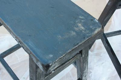
Below is what the stools looked like after a few hours of some serious elbow grease. Bad?  No, but still not the look I was going for.

I ended up doing the above process one more time and lightly sanded each stool and was much happier with the look.


There are some spots that the paint didn't come off, (upper right hand corner) but I don't mind it.  It adds character which the stools were lacking before. Also, two of the inner pieces of wood (bottom left) were different types of wood than the rest of the stool. The bottom left piece ended up getting painted, so that wasn't a big deal. The other one was a longer center piece that didn't get painted and it is noticeably a different color, but again it doesn't bug me.

I taped off the legs and painted the bottom portion using white paint I already had.

Then I gave them a couple coats of  Minwax Polyurethane,  except the "dipped" painted part.


And…here's how they turned out!


I'm in love with how they turned out!  And the best part is…I werked (wink) with what I had.


Have a great week! It's a short one!

xoxo,

Monday, November 10, 2014

{Styleboard} for Chairish


I have a love for vintage persian rugs, but due to their hefty price tag, I haven't been the proud owner of one yet. Recently, I came across a site called Chairish that sells pre-owned vintage rugs that are reasonably priced. I was asked to create a style board around one of their vintage rugs. I was given a few rugs to choose from and was asked to take the room from white to bright! Fun, right!?!

 Have you heard of Chairish? It's a San Francisco based online shop where you can buy and sell pre-loved decor to one another. They are known for their unique decor and accessories from all eras and styles. Think original mid-century pieces from Herman-Miller, Knoll, and Hermes! Many pieces listed are designer, antique or high-end modern and vintage pieces, but they also love non-branded items with great character.


Here are some of the rug options I could pick from to design around:

Turquoise Overdyed Turkish Rug
Hand Woven Rug
Issac Mizrahi Geometric Rug

Grass Green Abrash Turkish Rug

I chose to design around this Turquoise Overdyed Turkish Patchwork rug and decided I would design a living space.

This rug definitely takes a space from white to bright on its own! You can check out many of their other stylish rugs here


The next piece of furniture I chose was a couch. Which was easy for me because I've had my eye on this leather beauty for a really, really, really long time and since it's not in the budget in real life, a girl can dream, right?!   It's a big sofa at 108" and perfect for growing boys a comfy, modern living room. 


I wanted this room to be a mix of high and low pieces. The sofa and rug being the high (expensive) pieces and then mixed in low (less expensive) pieces.

Next was choosing artwork and I knew the perfect piece to add an industrial vibe. 

Artwork found here


Here is what I came up with:


A room can feel "bright" without adding a ton of color but by the mixing of textures, fabrics, mixed metals and splashes of colors.


Resources:

Kilim Pillow: One Kings Lane
Grey Kilim Pillow: One King Lane
California art: One Kings Lane
Tri-pod Floor Lamp: Lamps Plus
Side Table: Target
Nickel Task Lamp: JcPenny
Cowhide Chair: Hayneedle
Yellow Throw: West Elm
Wood Drum Table: World Market
Coffee Table: World Market
Yellow Chair: West Elm (no longer avail)
Mirror: Hayneedle
Striped Throw: West Elm
Sideboard: One Kings Lane
Mid-Century Chairs: One Kings Lane
Peacock Pillows: Purehome
Round Side Table: Crate & Barrel
Lamp: Lamps Plus
Vase: West Elm


                                                                    xoxo,

Friday, February 28, 2014

Tips on hanging a gallery wall

Happy Friday!!

Some may feel overwhelmed by the thought of hanging a gallery wall, but really it's quite easy. I always envisioned the stairwell being a huge gallery wall, (and still plan on adding to it) but I too felt overwhelmed at the thought of starting it. So, I started with the three large canvases that we already had on the wall and then "shopped" my house for the rest of the pictures. 

I traced each of the frames onto the paper (Ikea's roll of paper works well for this) and then cut them out. This helped with the placement of the frames onto the wall and because I'm a visual person I needed to see what it was going to look like before I started putting holes all over the wall! (FYI: when tracing the frames onto the paper also put a pencil mark where the picture hooks are on the back of the frame) I used painters tape to adhere the paper to the wall.


Once your happy with the placement of your photos you can then hammer in your nails on the paper (remember you've already marked on your paper where the nails belong). Then pull off the paper and hang your picture.


If your doing a smaller scale gallery wall another tip is to lay it out on the floor and take a picture of it. You can design different layouts and decide which one you like best before hanging it.  I used this technique with this gallery wall.

Need some more inspiration? Here are some of my favorites:


I love that these are all black and white and in matching frames. This gallery wall would be perfect for a home with clean lines, not too much color…a minimalist when it comes to decor.
{source}

This gallery wall screams 'eclectic' with its pop of color, mismatched frames, and its no order feel. It's fun, interesting and feels relaxed!

{source}

Love the impact of using smaller antique frames. This has an romantic, old charm feel.
{source}


I like how these canvases make one big square. Love that they are everyday photos, not real formal…but they make a huge statement!

{source}


So, I know I haven't been blogging much lately, but I have still been working on projects! If you follow me on Instagram or Facebook I shared this picture last week. 


This was the start of our outdoor chevron table! aka this momma's Valentine's present! No chocolates and roses over here! Yup, I don't let my guys off that easy. It's a labor of LOVE around here! 

 Well, I'm happy to say that we finished the table last week, just in time (literally the day before) for my cousin Debney's bridal shower at our house. I'll be sharing more pictures soon, but my husband and I are working on a tutorial for the table. It turned out AMAZING!! 
Even my little guys worked on it.

Can't wait to show you it to you guys!

Have a great weekend!


xoxo,